Large Tabular Models: The Next Frontier
Granica Research Team
What, why, and the evaluation problem
The last several years have seen remarkable advances in generative artificial intelligence (AI), with large language models (LLMs) taking center stage. LLMs have learned the structure of language to such a degree that they now power products used by hundreds of millions of people. As impressive as the progress has been, an LLM’s efficacy on a downstream task depends strongly on whether the underlying data can be represented as text.
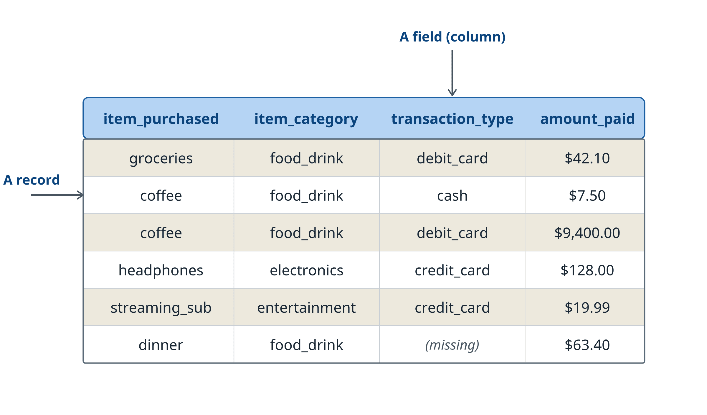
While this representation naturally arises in important applications such as coding, it fails to hold for many enterprise tasks, where the data comes in heterogeneous forms: bank transactions, medical records, customer databases, security logs, scientific measurements. Enterprise data looks like a table (Figure 1): rows of records, each carrying the same set of columns. Tables are the most common data format in enterprise settings, yet they do not fit into the paradigm of the current generative AI wave. We believe that to unlock the power of generative AI for enterprise, tabular data is the natural next frontier.
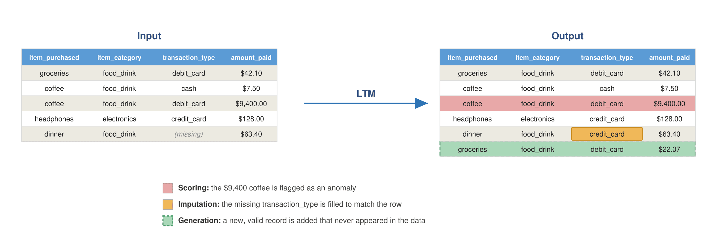
We refer to the class of generative models trained on tabular data as large tabular models (LTMs)1, a term introduced by Van Breugel and Van Der Schaar, just as generative models trained on text are called LLMs. An LTM learns the distribution of rows: the joint pattern of how a record’s columns tend to take their values together. A trained LTM can then execute many useful enterprise tasks (Figure 2). For example, the model can generate a new, valid record that never appeared in the data; fill in the missing entries of a partially complete row; or judge how surprising a given record is, which is the same as asking how likely the record is under the learned distribution.
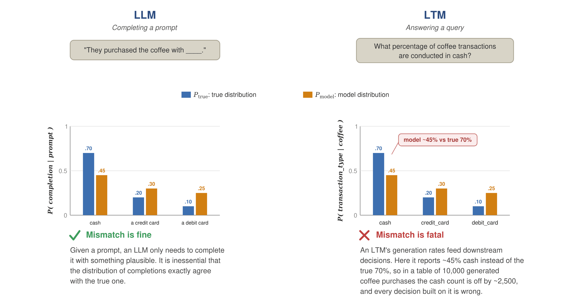
On first reflection, it is natural to think that LTMs are simply “language modeling for spreadsheets,” and that the tools built for text will transfer directly. Unfortunately they do not, and this is one of the central themes of this post. An LTM operates in a much more punishing setting. A language model is allowed, even encouraged, to be creative: ask it the same question twice and two different answers are fine, as long as they are plausible. However, the probability of these answers is not required to match their frequency in human discourse.
The opposite is true for an LTM, which must preserve fidelity: it must reproduce the real distribution of records, with the right probabilities and the right correlations between columns. Figure 3 illustrates why, by contrasting how the two kinds of model are used: prompt completion vs. statistical querying. Completing the prompt “They purchased the coffee with ____,” an LLM may answer cash, a credit card, or a debit card; any plausible completion is acceptable, so it does not matter whether the model produces them at the true frequencies. An LTM, by contrast, is used to answer statistical queries over the rows it generates, such as the share of coffee purchases paid in cash. Now the rates themselves are the answer: if the model generates cash ~45% of the time when the true rate is 70%, then in a table of 10,000 generated coffee purchases the cash count is off by roughly 2,500, and every statistic and downstream decision built on the data is wrong, even though each individual row is perfectly valid. Preserving fidelity, the probabilities and correlations of the true distribution, is therefore essential for an LTM in a way it is not for an LLM. Another challenge is that tabular data is genuinely high-dimensional in a way text is not, a point we return to below.
The difficulties posed by fidelity and high dimensionality make LTMs much harder to evaluate than their language counterparts. As we will show, evaluation metrics borrowed from the text/image generation world can fail badly on tabular data: a completely wrong model can earn a near-perfect score. Deploying a model that looks good by the wrong measure will incur significant operational costs: downstream enterprise workflows operate on the faulty data it produces, and fail as a result. Such an outcome is far costlier than evaluating properly in the first place, which is why we believe knowing how to evaluate an LTM is an essential first step toward building one. In the remainder of this post, we formally describe LTMs, expose the failures of traditional metrics for evaluating their performance, and lay out the principled evaluation framework we are developing in response to the unique challenges raised by tabular data.
Taxonomy of LTMs
LTMs can be defined and trained in settings of increasing generality, ranging from a single table to multiple databases.
Single table model. In its simplest instantiation the model is trained on a table with N rows and L columns, and learns the distribution of the rows. Recall from the introduction that, suitably prompted, the model can:
- Generate a new (unseen) row from the same distribution.
- Generate missing entries from a partially filled row (where the values can match existing records or not).
- Evaluate the likelihood of a certain row under the learned model.
More formally: each row is a vector with entries , where is the entry in row and column . Each entry can be of one of multiple data types. To keep the discussion concrete, we will focus on the case in which each column is categorical, taking values in one of categories: .
Database model. Training data consists of multiple tables in a database, with shared fields. The model can generate new (unseen) rows from the distribution of a join of multiple tables.
Foundation model. The training data consists of multiple databases , which are used for pre-training. The model is then finetuned on a specific target database but leverages the foundational knowledge acquired on the pre-training databases . The databases might share some information with the target , e.g. pertain to the same general domain (for instance, they all contain demographic information).
What is an LTM useful for?
As an LTM learns the full distribution of records, it can address a variety of enterprise tasks at once. We describe the most important ones below, some of which already appeared in the introduction.
Anomaly detection. By learning an accurate probabilistic model for the probability distribution of ‘normal events’ as captured by rows of a table, an LTM can be used to estimate the likelihood of a specific new observation/event, captured in a newly added row. Hence, it can be used to detect anomalies. Security logs, financial transactions, and so on are the typical data of interest in this case.
Data cleaning and imputation. Large data tables have a significant proportion of missing or grossly inaccurate entries: manually recorded data are inaccurate, devices malfunction, survey responses often contain missing entries. An LTM can fill those entries in a plausible way. More precisely: missing entries will be generated as to match the distribution of complete rows in the target data.
Rare sub-populations exploration. The most insightful part of your data is often the one pertaining to a rare subpopulation: a new customers’ segment; an atypical security log; data from a geographic area that was recently integrated in the data system and is therefore sparsely represented. An LTM can leverage data from more abundant populations (or data used in pre-training) to generate new plausible data from the rare sub-population.
Counterfactual analysis. ‘What would a customer with the same browsing history as X, but different demographics look like?’ ‘What would a typical credit card transaction by X look like, if it took place in country Y that X has never visited?’ LTMs can be used to explore what typical events look like in circumstances that have not been observed so far.
Replacing DB queries. Imagine a standard SELECT COUNT query, e.g.
SELECT
    species, COUNT(animal_id) AS total_population
FROM animals
WHERE habitat_zone = 'Rainforest' AND diet_type = 'Omnivore'
GROUP BY species;
An LTM is able to approximate the fraction of items satisfying the stated conditions, and hence to provide statistical answers (with confidence intervals) to such queries.
Why it is challenging to evaluate an LTM?
Intuition in plain English. The above use-cases clarify the desiderata for an LTM. Generated data should:
- Accurately reproduce the distribution of the training data.
- Accurately reproduce both single-column statistics and multi-column statistical correlations.
- Accurately reproduce conditional statistics on rare sub-populations.
As we stressed in the introduction, this demand for fidelity sets an LTM apart from a language model, which is free to answer the same question in many different ways. Tabular data is also more challenging than it first appears, as it is genuinely high-dimensional in a way that traditional data modalities such as text and images are not. The reason lies in how its columns relate. Most of the time they are only weakly correlated: knowing that a customer is a 25-year-old college dropout does not strongly determine their income or profession; they could be the founder of a highly successful startup. Strong dependencies do exist, but they typically arise only in narrow conditional slices: a 25-year-old college dropout with a $10 million income living in Palo Alto sharply restricts the possible professions. But because the columns are loosely coupled in the aggregate, the records do not collapse onto a few underlying factors; they spread out to fill a high-dimensional space.
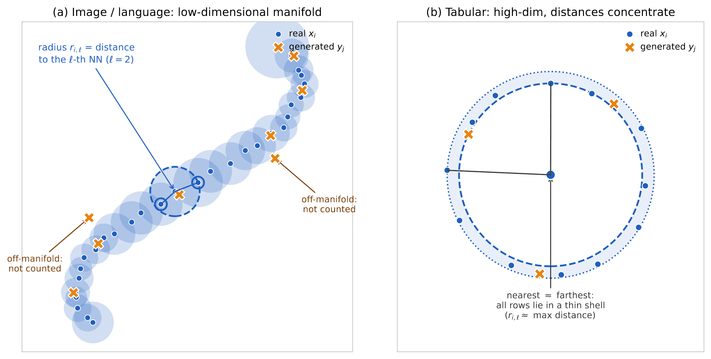
Text and images sit at the opposite extreme. Their strong dependence is stylized by the so-called ‘manifold hypothesis’: the data are high dimensional but lie close to a low-dimensional sub-manifold in the ambient space (see Figure 5, left, for an illustration). Consequently, metrics developed for evaluating generative models of text and images can suffer significant shortcomings when applied to tabular data, precisely because of this difference in structure.
We can summarize the main problems with standard evaluation techniques as follows:
- They attempt to assess whether generated samples lie in a ‘valid subset’ of the ambient space, and not whether they are generated with the correct probabilities.
- They are designed to work well for cases in which this ‘valid subset’ is a low-dimensional submanifold of the ambient space.
- They do not assess uncertainty on the metric of interest that is inherent in sampling.
Some definitions
In order to be more precise, we will assume that the rows of the input table are independent samples from a common probability distribution (the distribution of all data from the target population, of which our table contains only a portion). Our generative model instead produces samples with distribution .
For assessing the quality of the generative model, we use:
- A hold-out subset of m rows from the input table, say .
- m generated rows from our generative model .
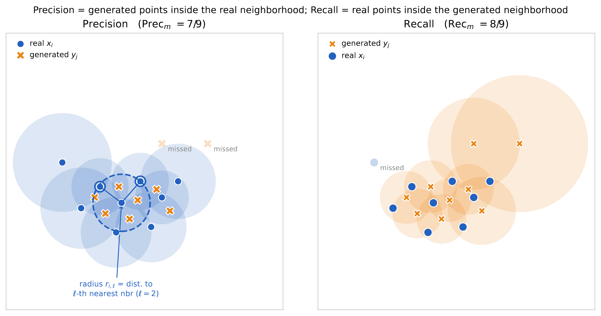
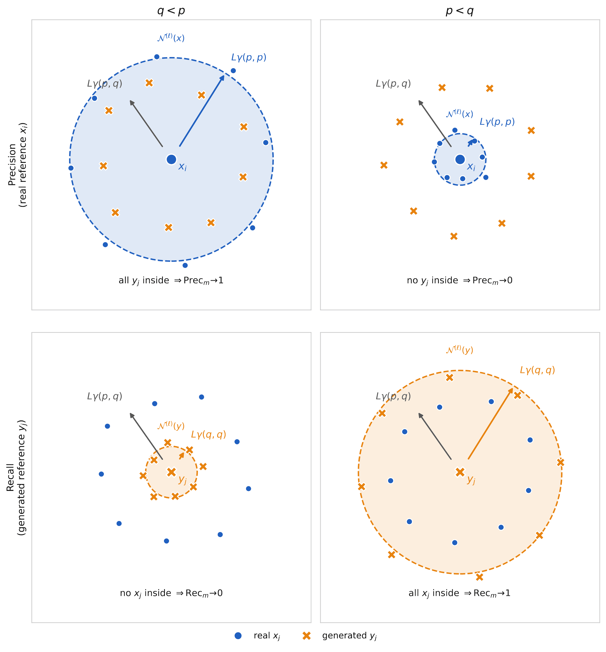
We will use the shorthands and for these sets of rows. In order to describe the challenge of evaluating LTMs, we will focus on two specific metrics that are very popular among researchers: precision and recall2,3,4,5. We define these precisely but also construct Figure 4 to aid intuition.
Denote by the space to which rows of the table belong: . Given data , we construct their ℓ-th neighborhood as
where is the ball of radius r centered at x (in whatever distance we choose to use in the space ), and is the distance from of the ℓ-th closest point to :
Usually ℓ is chosen to be a small constant, e.g. or . It is now easy to define precision and recall.
Precision. The fraction of generated samples that falls within the ℓ-th neighborhood of the holdout set.
Here denotes the number of elements of set S, and is shorthand for an array of ordinal indices.
Recall. The fraction of holdout samples that falls within the ℓ-th neighborhood of the generated set.
In other words, the role of generated and holdout set is precisely reversed in the definition of recall.
Failures: a toy example
Intuitively, precision should measure how close the generated data lie to the real data manifold, while recall measures how well the real data is captured by the generated data manifold. This geometric intuition is portrayed in Figure 5, left frame. This intuition is misleading with high-dimensional data, such as tabular data when the number of columns is large and correlations between columns are noisy.
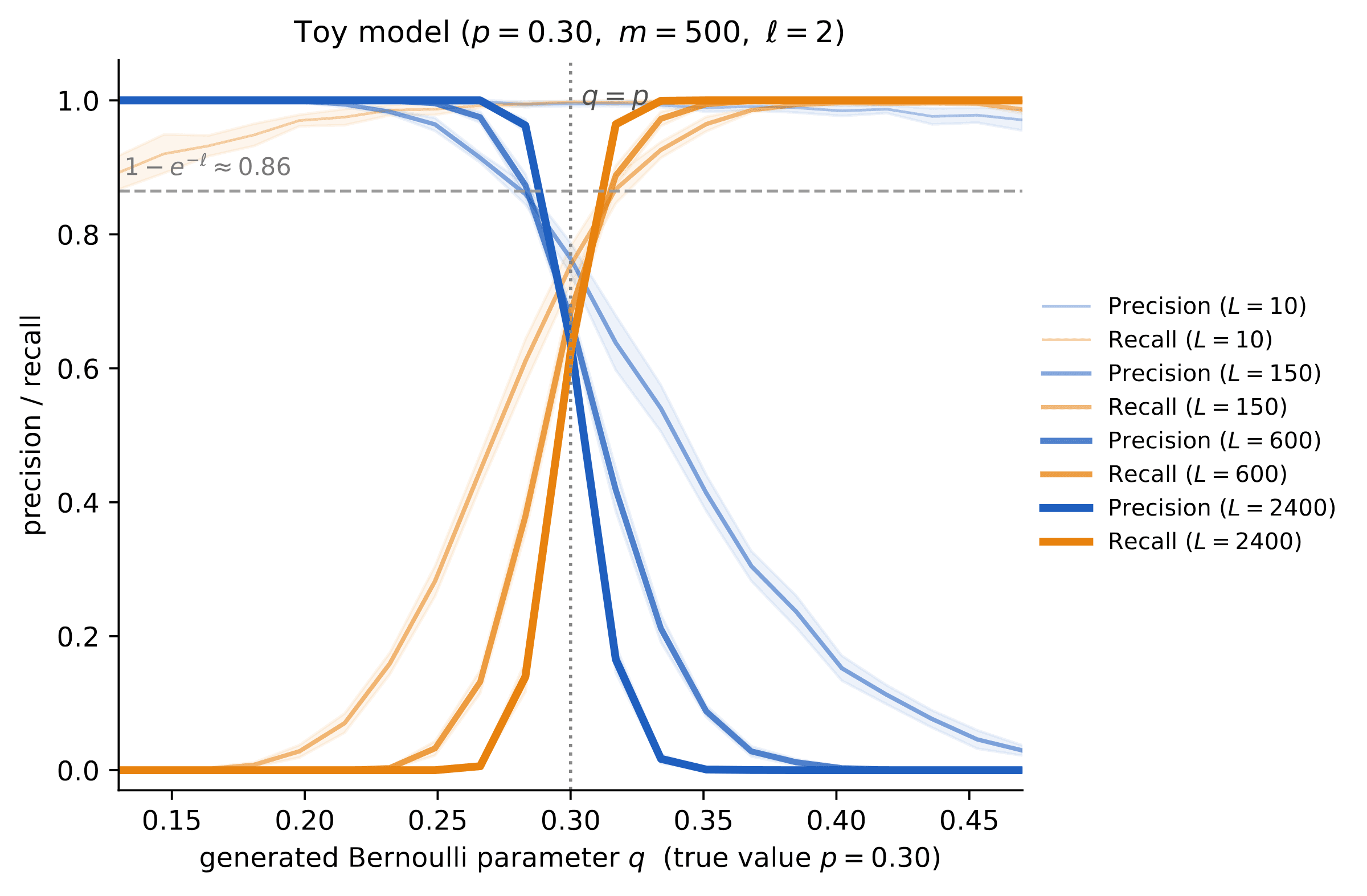
We can precisely understand this failure in a simple example. All columns are binary, i.e. for all , hence , and:
- Under the target distribution, columns are independent with for all .
- Under the generated distribution, columns are independent with for all .
In words, the real data records a collection of p-biased coin tosses for each column, while our generative model produces q-biased coin tosses. We also assume that the number of rows is smaller than exponentially large in the number of columns (our calculations can be generalized beyond this setting, but we refrain from doing so for simplicity). We take to be the Hamming distance in this case.
It is easy to check that, for any ,
The key remark is that all the distances concentrate around these expected values. Namely, for any ,
with probability converging to one as . In particular, we have, uniformly over i, ℓ,
In other words, the situation is very different from the low-dimensional picture of Figure 5, left frame. Drawing the actual high-dimensional geometry is obviously impossible, but Figure 5, right frame, attempts to give such a picture from the point of view of a real data point . All pairs are roughly at the same distance from each other. Hence, all real data distinct from lie in a thin spherical shell centered at and with radius .
On the other hand, the closest point to a generated point is at distance roughly . A simple algebraic manipulation yields (for simplicity we assume ):
This implies that the geometry of the two point clouds and is very different from what low-dimensional intuition would suggest:
- If the generative model uses , then each generated row is much closer to the closest hold-out row than any pair of distinct hold-out rows. On the other hand, each hold-out row is much farther from the closest generated row, than two generated rows are among themselves. Hence, for large :
- If the generative model uses , then the role of generated and hold-out data is reversed:
Figure 6 is a cartoon of this phenomenon. Figure 7 validates these findings with a small numerical simulation.
Remarks.
- We note that in fact the same conclusion holds when depends on , provided .
- The above qualitative conclusions remain true if the real data distribution and the generative distribution have dependent columns, provided they satisfy suitable concentration properties.
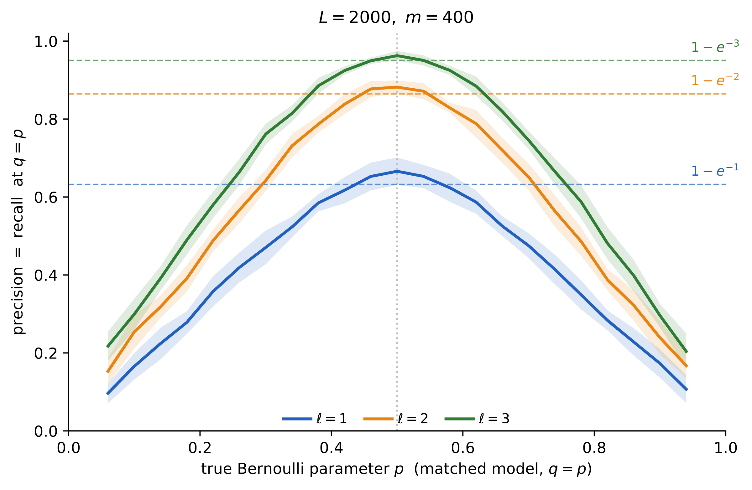
What happens in the ‘just right’ case, ? We claim that, for fixed , we have
To see that this is the case we can take, without loss of generality, . We then note that are exchangeable, and therefore the probability that any of them is among the ℓ closest to is exactly .
In order to proceed, we consider the case . In this case it can be shown that, for fixed i, the m events , are approximately independent and therefore, for large ,
Note that this is nothing but the expectation of the precision, and by a concentration argument this is actually the typical value of the precision. Exchanging the role of hold-out and generated set, we get
While we assumed here , precision and recall behave even worse for , and it is possible to show that they are asymptotically smaller than , as demonstrated in Figure 8.
Summary
- Perfect precision or perfect recall can be achieved by a completely wrong generative model.
- Precision and recall are insensitive to the dependencies between columns.
- Precision and recall can change very abruptly with the model quality (see Eqs. 12, 13, and Figure 7).
- Even with a perfect generative model, precision and recall are bounded away from one (Eq. 16 and Figure 8).
Our approach
We adopt the following general framework based on three components.
Probability metrics. Define an array of metrics as distances between probability distributions that capture single-column and multi-column statistics. In particular, we privilege metrics focused on rare sub-populations.
Uncertainty quantification. Assess statistical uncertainty on these metrics, due to the finiteness of the sample m. We do this by resampling techniques (bootstrap).
Ideal values. Compare the resulting metrics with ideal ones obtained by hold-out vs hold-out comparison.
Let us emphasize the importance of the last two components. First, any metric computation is based on a finite sample size m, and hence subject to uncertainties. These uncertainties become more important as the accuracy of the generative model increases. Accurately assessing these uncertainties is crucial to be able to confidently compare different models.
Second, even if the generative model is perfect, the distance from the hold-out set can be strictly positive because we evaluate the metrics on finite samples of size m. An example is given by the optimal precision and recall in Eq. 17, which are strictly smaller than one.
A continuously updated library of metrics and related documentation is given in our LTM evaluation package, ltm-eval.
An example: trend and conditional trend
Given subsets of column indices we define:
- The marginal distribution of entries in columns S, (for hold-out data), and (for generated data).
- The conditional distribution of entries in columns S, given values of columns R: (for hold-out data), and (for generated data).
If we will also write instead of .
The so-called trend score measures the accuracy of the generative model in capturing pairwise marginals:
where the total variation distance is given by
Let us emphasize that measures the similarity between the population distribution of real and generated data, what we would measure if we could observe a hold-out set and generated set of samples. In practice we have to construct an estimator from finite samples . The simple estimator that we use is the ‘plug-in’ estimator:
where , are the empirical distributions of the hold-out and generated samples respectively (putting mass on each sample).
In general, the plug-in estimator is not optimal: we implement it nevertheless because it is simple and well known. One very obvious defect is that it is biased downwards, as can be seen from the fact that, even if (and hence ) and differ because of sampling randomness, and therefore typically . Our evaluation of the ‘ideal value’ (see below) alleviates this issue.
Conditional trend. One important shortcoming of the trend metric in Eq. 18 is that it implicitly weighs sub-populations by the frequency of occurrence in the hold-out set. In order to focus on rare sub-populations, we define a conditional trend as
In words, is the trend score for the sub-population that takes value x for column k. Given a subset of values for each column k, we aggregate this score uniformly over values and columns:
Independently of the choice of the sets , note an important difference with respect to the unconditional trend. Each sub-population (defined by the value ) is assigned equal weight instead of being weighted by its frequency .
We consider two ways of defining :
- Average on all: comprises all possible assignments of variable , excluding only those that occur in the hold-out set less than a threshold value , for stability reasons. In practice we often use .
- Average on rare: comprises all assignments of variable whose frequency in the hold-out set is (i.e. they occur at least times and at most times). In practice we typically use .
Resampling and ideal values
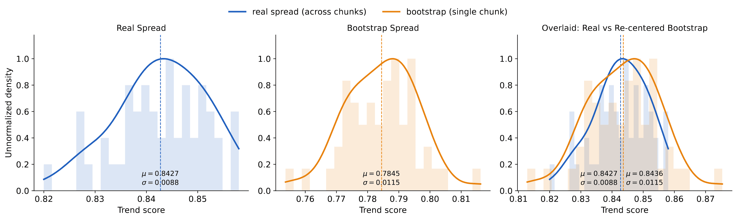
We now demonstrate the two remaining components of our framework: uncertainty quantification and ideal values. We use the Adult dataset as the target6, TabDiff as the generator7, and the trend score of Eq. 18 as the metric. We used a total of 9,750 hold-out samples.
As noted above, any metric computed on a finite sample carries uncertainty. To get a sense of this uncertainty, we partition the 9,750 hold-out samples into 50 disjoint hold-out sets of size : we refer to these as ‘chunks’. We pair each with an independent generated chunk, and measure the trend score on each pair (Figure 9, left frame). In practice one has only a single such hold-out/generated pair of size m, so our procedure instead estimates the variability from that one split by bootstrap. As Figure 9 (center and right) shows, the bootstrap reproduces the across-chunk spread, so a single hold-out/generated split is enough to quantify the uncertainty of the metric.
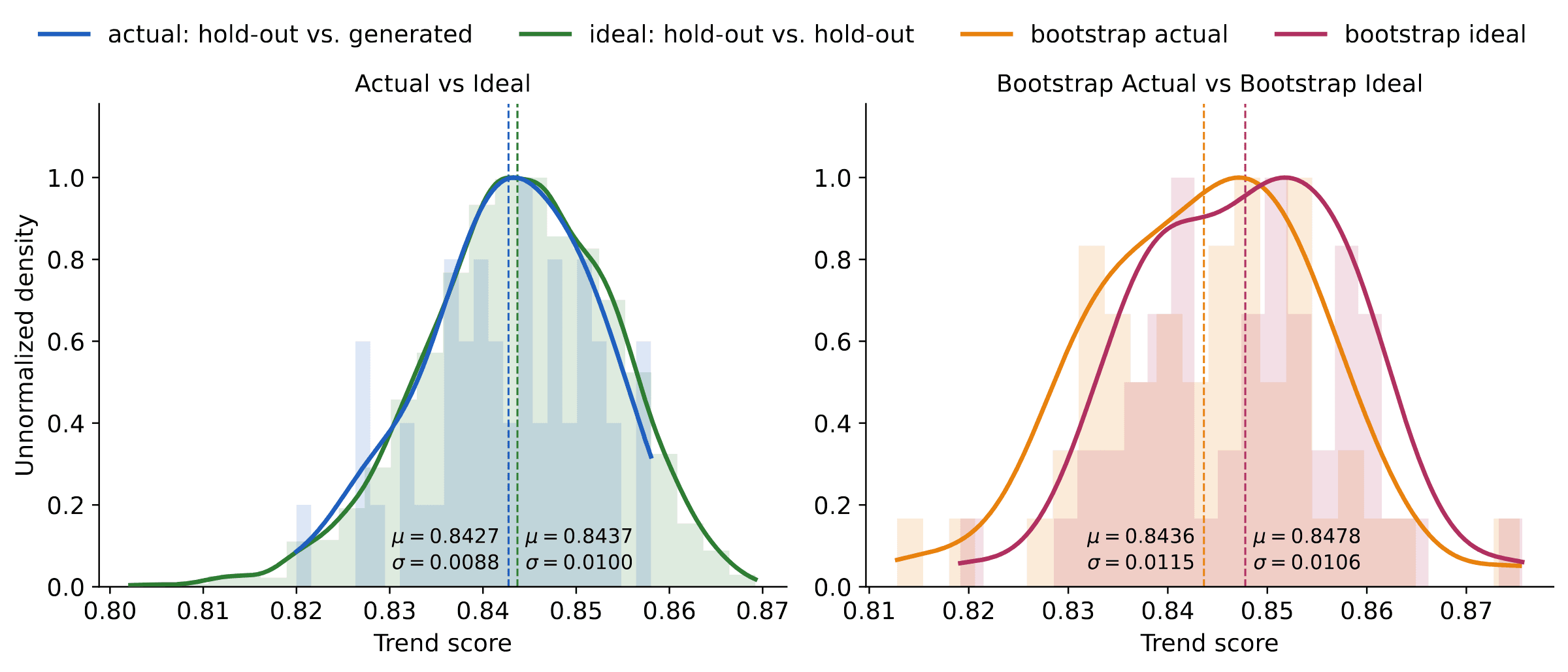
Moreover, the absolute value of the metric is hard to read on its own. Is a trend score of 0.85 good, mediocre, or bad? The score becomes interpretable when grounded against its ideal value: the score obtained when the generated set of size m is replaced by a second, independent hold-out also of size m. Figure 10 shows that the generated data already matches this ideal: at this sample size the trend score cannot separate it from real data. The same conclusion follows from a single bootstrapped split.
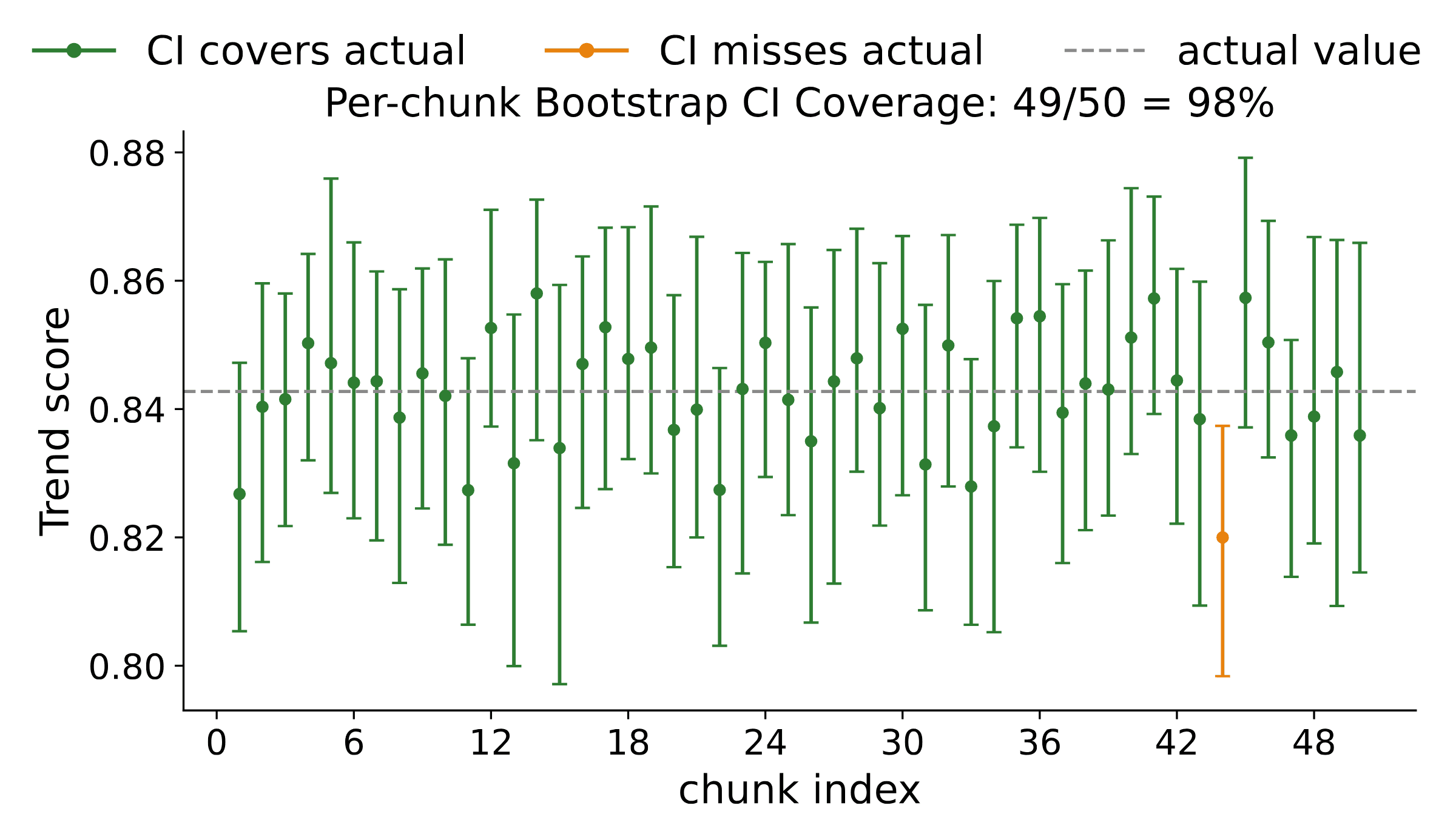
Finally, this analysis lets us compute error bars on the metrics we estimate, and error bars are only useful if they are calibrated. Figure 11 confirms that the per-chunk bootstrap confidence intervals cover the reference value about as often as their nominal level prescribes.
Together, these experiments show that a single hold-out/generated pair lets us estimate a metric, a calibrated error bar that quantifies its uncertainty, and a baseline for how good the metric could possibly be.
Continue reading
Browse the rest of our work on tabular generation, compression, and evaluation on the Labs page.
References
- 1.Van Breugel, B. & Van Der Schaar, M. Position: Why Tabular Foundation Models Should Be a Research Priority. ICML, 2024.
- 2.Sajjadi, M. S. M., Bachem, O., Lucic, M., Bousquet, O. & Gelly, S. Assessing Generative Models via Precision and Recall. NeurIPS, 2018.
- 3.Kynkäänniemi, T., Karras, T., Laine, S., Lehtinen, J. & Aila, T. Improved Precision and Recall Metric for Assessing Generative Models. NeurIPS, 2019.
- 4.Naeem, M. F., Oh, S. J., Uh, Y., Choi, Y. & Yoo, J. Reliable Fidelity and Diversity Metrics for Generative Models. ICML, 2020.
- 5.Alaa, A., Van Breugel, B., Saveliev, E. & van der Schaar, M. How Faithful is your Synthetic Data? Sample-level Metrics for Evaluating and Auditing Generative Models. ICML, 2022.
- 6.Becker, B. & Kohavi, R. Adult. UCI Machine Learning Repository, 1996.
- 7.Shi, J., Xu, M., Hua, H., Zhang, H., Ermon, S. & Leskovec, J. TabDiff: a Mixed-type Diffusion Model for Tabular Data Generation. ICLR, 2025.